
LOADING SPINNERS
Contextual and Default spinners

“Transforming wait times into fun moments within the
Singapore Airlines app journey“
PROJECT GOAL
This project aims to enhance user experience by introducing new loading spinner designs such as
MY ROLE & OBJECTIVE
ROLE
As a UX designer, I took on the role of motion designer in this project to enrich the user experience. While focusing on intuitive interface layouts and user flows as a UX designer, I also integrated dynamic motion elements to enhance interactions and evoke emotions. This combination ensured that the interface not only functioned smoothly but also captivated users, ultimately resulting in a more enjoyable and memorable experience.
OBJECTIVES
-
Delivering a Unique Brand Experience:
-
SQ Mobile UX introduces a new default spinner design, thoughtfully incorporating SIA's iconic batik pattern and brand-specific colours.
-
What it serves: It ensures brand consistency and improves user experience by seamlessly blending SIA's identity into every interaction.
-
-
Facilitating Travel with Timely and Contextual Information:
-
Unlike conventional loading spinners, our new spinners provide context regarding the user's next steps.
-
What it serves: Each step will have a spinner related to the page's content, providing context for the next step in the user journey.
-
-
Inspiring Travel and Engaging Customers:
-
Creating a loading experience that not only informs users about their progress but also adds a touch of delight to their interactions by featuring unique animated illustrations at each stage.
-
What it serves: This approach ensures that users stay engaged and well-informed during waiting periods, enhancing overall satisfaction.
-
CONTEXTUAL SPINNERS
To kickstart the project, the entire app flow was mapped out, and key areas where contextual spinners could be incorporated were identified.
Glassbox stats revealed that the booking flow was the most significant area of interaction for users, making it the primary focus for implementing contextual spinners.
IDENTIFYING SPINNER AREAS IN BOOKING FLOW
Every stage of the booking flow was carefully considered, with the aim of immersing users in the travel experience.
![Contextual Loading Spinners_CIB [Booking] - Spinner placement locations (1).jpg](https://static.wixstatic.com/media/93e528_544f1e48c79d4304b2f31107f5706dc1~mv2.jpg/v1/fill/w_843,h_400,al_c,q_80,usm_0.66_1.00_0.01,enc_avif,quality_auto/Contextual%20Loading%20Spinners_CIB%20%5BBooking%5D%20-%20Spinner%20placement%20locations%20(1).jpg)
SPINNER CREATION JOURNEY
SEARCH RESULTS
Ideation:
Instead of using a magnifying glass searching flights, I chose to depict a flight moving through clouds. This represents the journey of searching for flights and suggests the smooth travel experience users can expect.
Survey Question:
Any feedback regarding the new contextual loading spinner
Feedback Considered:
"For search results spinner, can we include more details to the a/c so the livery looks closer to actual?"
"The blue flight color doesn't resemble an SQ flight. Can we try to make it more similar to SQ?"
Proposed Design

Enhanced Design

PASSENGER DETAILS
Ideation:
Originally, the design depicted a man dragging luggage while walking. However, in response to feedback, I redesigned it to showcase a variety of passenger profiles with families, individuals, couples, and infants moving along a travellator.
Survey Question:
Any feedback regarding the new contextual loading spinner
Feedback Considered:
"I don't mind the person walking, but it might be nice to see different kinds of travellers, not just one."
Proposed Design

Enhanced Design

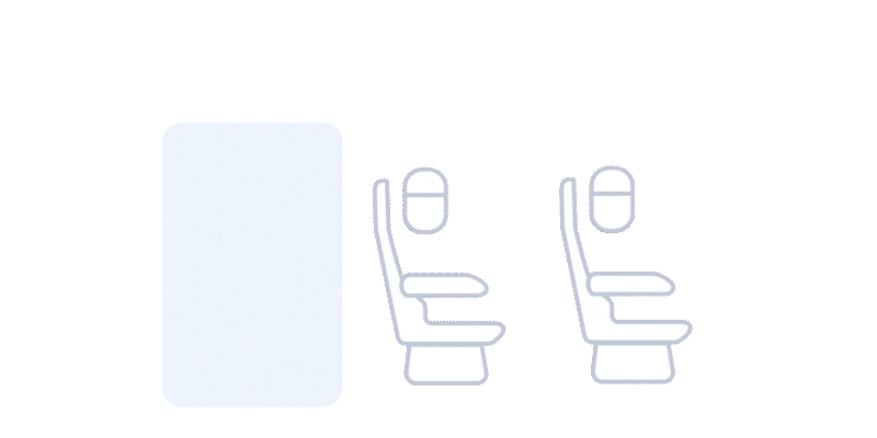
SEAT SELECTION
Ideation:
I designed spinners to visually represent the variety of available seats for selection, emphasizing the range of seat options and making them appear selectable.
Survey Question:
Any feedback regarding the new contextual loading spinner
Feedback Considered:
"I find seat 43A very uncomfortable and would prefer not to have it assigned to me."
Proposed Design
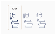
Enhanced Design

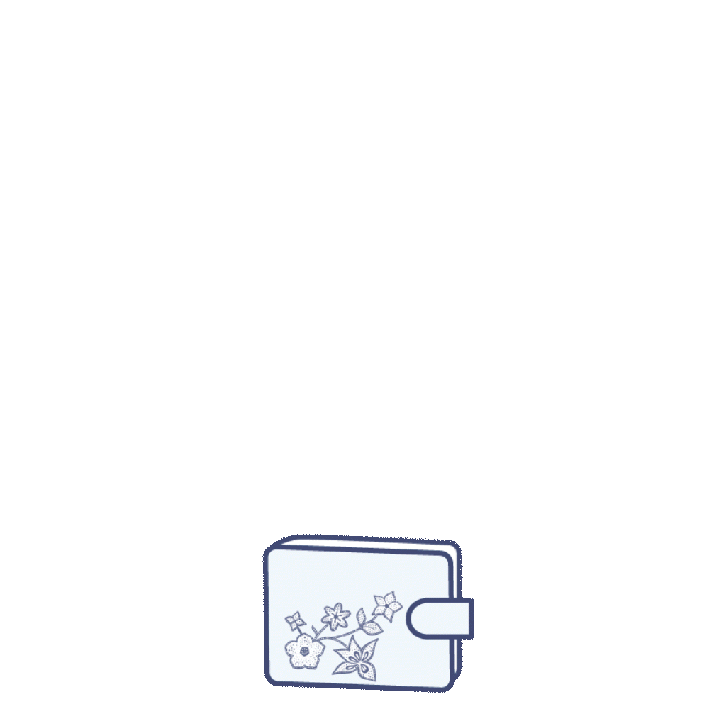
PAYMENT SELECTION
Ideation
Incorporated a wallet with a card positioned at the top to signify payment methods, while incorporating batik motifs to evoke the distinctive SIA touch.
Survey Question:
Any feedback regarding the new contextual loading spinner
Feedback Considered:
"The wallet icon is straightforward and easy to understand"
Proposed Design

Enhanced Design (No Change)
PAYMENT PROCESSING
Ideation:
Integrated vibrations and a card-tapping design to symbolize the payment is processing.
Survey Question:
Any feedback regarding the new contextual loading spinner
Feedback Considered:
" It is clear that my payment is being processed."
Proposed Design

Enhanced Design (No Change)
TEXT HIERARCHY
Attention to detail extended to having a personalized copy to provide joy and professionalism simultaneously. Each message was carefully curated to maintain a tone that resonated with users, further enhancing their overall experience.
We've wrapped it all up with personalized headers and descriptions for each part of the flow.
SEARCH RESULTS

PAYMENT METHOD

PAX DETAILS


PAYMENT PROCESSING


SEAT SELECTION

DEFAULT SPINNER
You open the Singapore Airlines mobile app, and instead of the plain old round spinner, you see something special – a stunning loading animation inspired by batik designs. How lovely it is to watch those beautiful patterns unfold!
SIGNIFICANCE OF BATIK
Recognising the opportunity to infuse the loading animation with cultural richness and brand relevance, we introduced batik-inspired designs. Batik holds deep cultural significance. By incorporating batik patterns into the loading animation, we aimed to create a visually captivating experience that resonated with users and reinforced the brand identity of Singapore Airlines.
OBJECTIVES
Enhance visual appeal
Replace the default spinner with a visually engaging design that reflects the SIA brand.
Improve brand representation
Incorporate batik patterns to infuse cultural elements and strengthen brand identity.
Enhance user experience
Provide users with a more visually appealing and culturally relevant spinner during loading processes.
Ensure technical feasibility
Ensure that the custom spinner design is technically feasible and compatible with the SIA mobile application
DEFAULT SPINNER JOURNEY
OLD SPINNER
The previous design featured a simplistic and generic round spinner

NEW SPINNER
Choosing batik for the default spinner in the Singapore Airlines app reflects a heartfelt nod to cultural heritage, visually delights users, and reinforces brand identity with elegance and distinction.

OUTCOME
The project resulted in the successful replacement of the default spinner with a custom design featuring batik patterns, enhancing the visual appeal of the SIA mobile application and strengthening its brand representation.
Users now experience a culturally relevant and visually engaging spinner during loading processes, contributing to an improved overall user experience.
FEEL THE EXPERIENCE
Experience William Lee's journey to Hanoi on 27th Feb.
Click on the prototype to immerse yourself in the experience.
FESTIVE SPINNERS
Themed around Diwali, Christmas, Chinese New Year and Hari Raya, the new loading spinner features designs that are unique to each festival.
For instance, during Christmas, holly leaves and berries surround the spinner and traditional elements such as the lion dance are used for Chinese New Year. In addition, diyas are used for Diwali and ketupat is shown for Hari raya. We hope these small changes will bring some extra joy to our passengers during their travels.
DIWALI
Ideation for Diwali loading spinner
Inspiration
This loading spinner is inspired by the traditional Indian festival of lights and includes intricate designs and patterns. It is a beautiful way to wish SIA passengers a happy Diwali!
The use of elephants
Elephants, symbolising purity and good luck, add a touch of auspiciousness to the festivities.
The presence of Diya (light)
The Diya, representing the triumph of light over darkness and good over evil, illuminates our celebration.
Traditional elements
Traditional motifs create a festive ambience, capturing the essence of the occasion.
Brand department
We ensure that our static designs align with our brand guidelines through careful review.

HARI RAYA
Ideation for Diwali loading spinner
Inspiration
The inspiration for Hari raya came from reflecting on the traditions and cultural significance of this festive occasion.
The colour if green
Green symbolises renewal and prosperity.
Moon
The moon represents the cycle of life and harmony.
Ketupat
It adds a traditional touch and symbolises unity and gratitude, representing the importance of togetherness and appreciation during Hari raya celebration


